Flat List Design in SwiftUI
Introduction
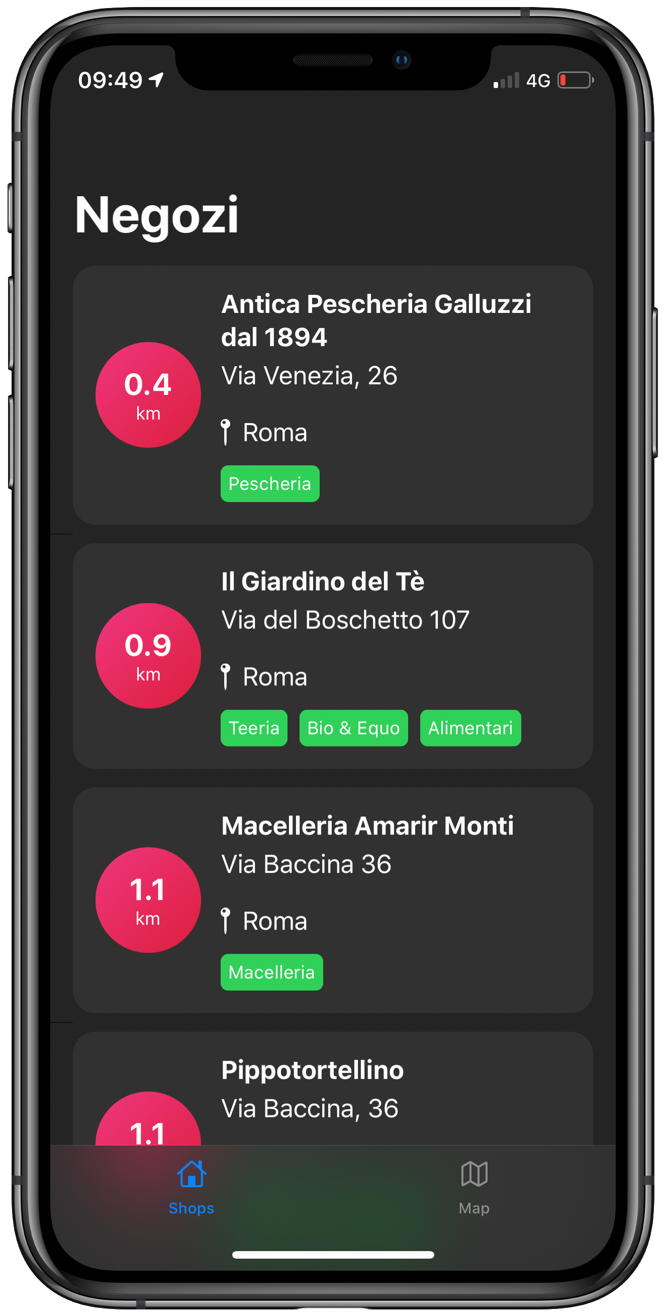
I’m going to explain the little steps that are needed to achieve a good looking flat design in an iOS application that displays a list. Here’s the example I’m going to build.
Changing Your List’s Background and Hiding Its Separators
The first thing we need to do is change the list’s background and hide its separators.
Since List makes use of the old UITableView from UIKit, we just need to
change a few parameters when the SwiftUI View is going to be initialised.
extension UIColor {
    static let flatDarkBackground = UIColor(red: 36, green: 36, blue: 36)
    static let flatDarkCardBackground = UIColor(red: 46, green: 46, blue: 46)

    convenience init(red: Int, green: Int, blue: Int, a: CGFloat = 1.0) {
        self.init(red: CGFloat(red) / 255.0, green: CGFloat(green) / 255.0, blue: CGFloat(blue) / 255.0, alpha: a)
    }
}

extension Color {
    public init(decimalRed red: Double, green: Double, blue: Double) {
        self.init(red: red / 255, green: green / 255, blue: blue / 255)
    }

    public static var flatDarkBackground: Color {
        return Color(decimalRed: 36, green: 36, blue: 36)
    }

    public static var flatDarkCardBackground: Color {
        return Color(decimalRed: 46, green: 46, blue: 46)
    }
}
When that’s done, we’re going to see a list with our predefined background
color. The separators are now gone, but the row itself will display in black or
white, depending on the colorScheme of the application. To make it the same
color as the background, we just need to add this property to the row
.listRowBackground(Color.flatDarkBackground), and voilà.
Row-Card Decomposition
I’ve created this small infographic to give you a better idea of how the card itself can be created in SwiftUI.
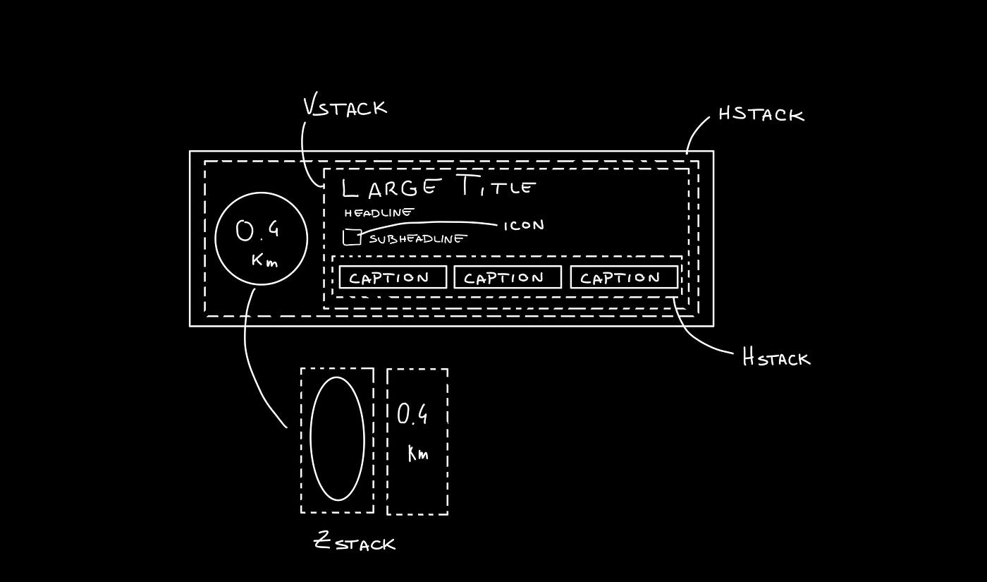
As you can see we can divide the row card into four different components:
-
ZStackto encapsulate the kilometers indication -
VStackto encapsulate the row card info -
HStackto lay out the two components above -
HStackto lay out the caption pills in the row card’s info body
The code
Let’s go through the implementation.
struct StoreRow: View {

    var title: String
    var address: String
    var city: String
    var categories: [String]
    var kilometres: Double

    var body: some View {
        ZStack(alignment: .leading) {

            Color.flatDarkCardBackground
            HStack {
                ZStack {
                    Circle()
                        .fill(
                            LinearGradient(
                                gradient: Gradient(colors: [.lightRed, .darkRed]),
                                startPoint: .topLeading,
                                endPoint: .bottomTrailing
                            )
                        )

                    VStack {
                        Text("\(kilometres)")
                            .font(.system(size: 20, weight: .bold))
                            .foregroundColor(.white)

                        Text("km")
                            .font(.caption)
                            .foregroundColor(.white)
                    }
                }
                .frame(width: 70, height: 70, alignment: .center)

                VStack(alignment: .leading) {
                    Text(title)
                        .font(.headline)
                        .fontWeight(.bold)
                        .lineLimit(2)
                        .padding(.bottom, 5)

                    Text(address)
                        .padding(.bottom, 5)

                    HStack(alignment: .center) {
                        Image(systemName: "mappin")
                        Text(city)
                    }
                    .padding(.bottom, 5)

                    HStack {
                        ForEach(categories, id: \.self) { category in
                            CategoryPill(categoryName: category)
                        }
                    }

                }
                .padding(.horizontal, 5)
            }
            .padding(15)
        }
        .clipShape(RoundedRectangle(cornerRadius: 15))
    }
}
The first thing we’re going to declare is the info we’re going to display on the
card itself — this way we can later pass these variables dynamically from its
parent view. To give the row card a lighter background, we declare an outer
ZStack that will contain the Color.flatDarkCardBacground and the HStack
that contains every row-card component.
Next, we implement a ZStack that’ll generate the red circle with the
kilometers indication. This will contain a circle shape filled with a linear
gradient to give it a nice touch. On top of that, there’s going to be some
simple text with the kilometer info.
Moving onto the row-card body, we embed the info in a VStack. The first two
components are simple texts with different font sizes. The third element is an
HStack used to display the icon image next to the text. The last element is a
simple HStack that’ll render the green pills with a dynamic ForEach element
given an array of strings.
Note: It’s always a good practice to separate these components as much as possible to make them easily reusable and flexible.
The CategoryPill view looks as simple as this:
struct CategoryPill: View {

    var categoryName: String
    var fontSize: CGFloat = 12.0

    var body: some View {
        ZStack {
            Text(categoryName)
                .font(.system(size: fontSize, weight: .regular))
                .lineLimit(2)
                .foregroundColor(.white)
                .padding(5)
                .background(Color.green)
                .cornerRadius(5)
        }
    }
}
As you could have imagined, we’re dealing with a simple text element with a background color and a corner radius.
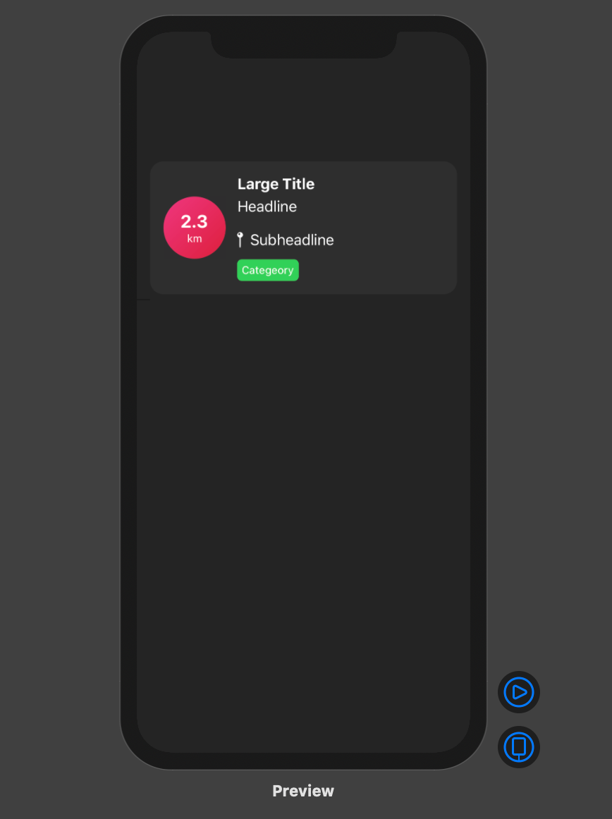
Final result
Conclusion
I hope you enjoyed this tutorial and learned how simple it can be to design great UIs with the help of a declarative language like SwiftUI. We’re all looking forward to seeing how much better it can get with version 2.0, which is coming at WWDC20.
See you in the next article, and thank you for stopping by!